Core Concepts
Core Concepts
Library is a place where you create and manage colors, gradients, shadows, images and variables. The behavior of these library items is tailored to the needs of user interface design.
For example, you can use the same color in several graphic shapes. Later, if you adjust the color, all shapes using it are updated automatically. The same is also true for gradients, shadows, images and variables.
This feature is extremely handy, because you can, among other things, adjust the color scheme of the user interface you are designing easily and in one place.
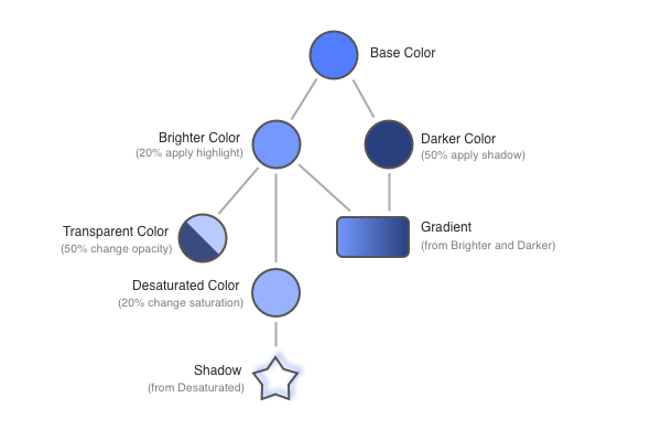
Moreover, some library items can form relationships. For example, a new color can be derived from an existing one simply by using the built-in operations. Gradients and shadows can also be derived from colors in the library. Expression variables can reference other library items.

By taking advantage of this feature, you can define a whole family tree of colors, gradients and shadows that depend on a single (or more) basic colors. When you adjust this basic color, all library items and shapes that directly or indirectly depend on it are updated automatically:
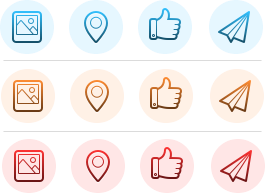
For example, if you are designing a set of colorful user interface controls, you can derive all necessary colors, gradients and shadows from a single basic color. By adjusting this basic color later, you can easily change the whole color scheme of your entire document:
Naming
Each library item has a name. PaintCode generates these names for you, but you can (and probably should) provide your own, more descriptive names for your library items. These names are used for code generation. You can use spaces in your names - PaintCode automatically converts “Button Base Color” to “buttonBaseColor” in the generated code. It will also not allow you to use names that are already reserved for code generation purposes, so you do not have to worry about any potential name conflicts in the generated source code. Library items can be renamed in their respective adjusting popovers, which you can access by double-clicking on a library item.
Using the Library
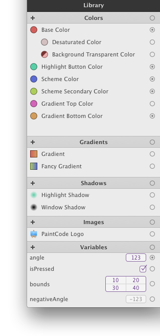
The Library is divided into 5 sections: Colors, Gradients, Shadows, Images and Variables. To add a new library item (for example, a color), click the “+” button at the top of the corresponding Library section.
To remove a library item, select the item from the item list by clicking on it and press the DELETE or BACKSPACE key. To adjust an existing library item, double click the item in the list. Alternatively, you can click on the Library Item Well in the Inspector to show the editing popover.
Copy & Paste Behavior
When you copy and paste some shapes between documents, all necessary colors, gradients, shadows and images are automatically copied to the target document as well. If the target document already contains the necessary library items, these are reused instead.
Configuring Library Items to Behave as Parameters
Each library item has a special popup button right next to its "Name" text field (the popup button has a cogwheel icon on it).
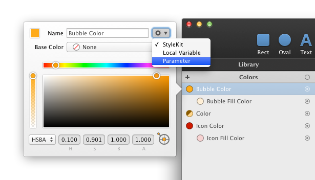
Here, you can configure the behavior of the library item. This is important for code generation purposes, as well as for using symbols.
By changing the behavior popup button to "Parameter", you'll ensure that the generated drawing method of each canvas where the library item is used will have a parameter that corresponds to that particular library item. This allows you to, for example, create a drawing method that draws an icon using a color you specify at runtime.
If you choose the "StyleKit" behavior, the library item will automatically be added to your StyleKit.